

🍁 Beyond the Basics: Making UI Builder Feel Alive (Upcoming PTO Page)
On October 17, 2025, I had the pleasure of presenting at nullEDGE 2025, a virtual ServiceNow-inspired conference where builders, creators, and innovators came together to share ideas and push the platform further.
Most developers know how to add components in UI Builder: drag, drop, bind, done. For my Beyond the Basics session, I wanted to go deeper.
Instead of building another workspace page that lists records in a grid, I wanted something more dynamic, something that reacts to the user, the time of day, and their role. That’s how my Upcoming PTO workspace came to life.

🏠 Step 1: The Fall-Themed Header
Before I touched a single data resource, I started with the vibe. The page needed to feel seasonal and personal, so I built a fall-themed header that changes based on the user and time of day.


🍂 Conditional Renderer and Controller
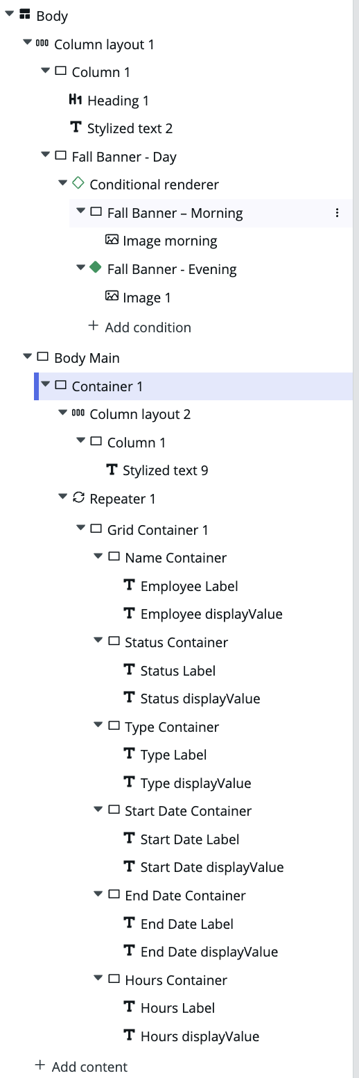
At the top of the page, I added a Conditional Renderer with two images:
A warm, sunny fall banner for daytime
A darker, cozy one for evening
I created a custom controller to check the system’s hour when the page loads and decide which image to show:
I created the client script, getTimeOfDay
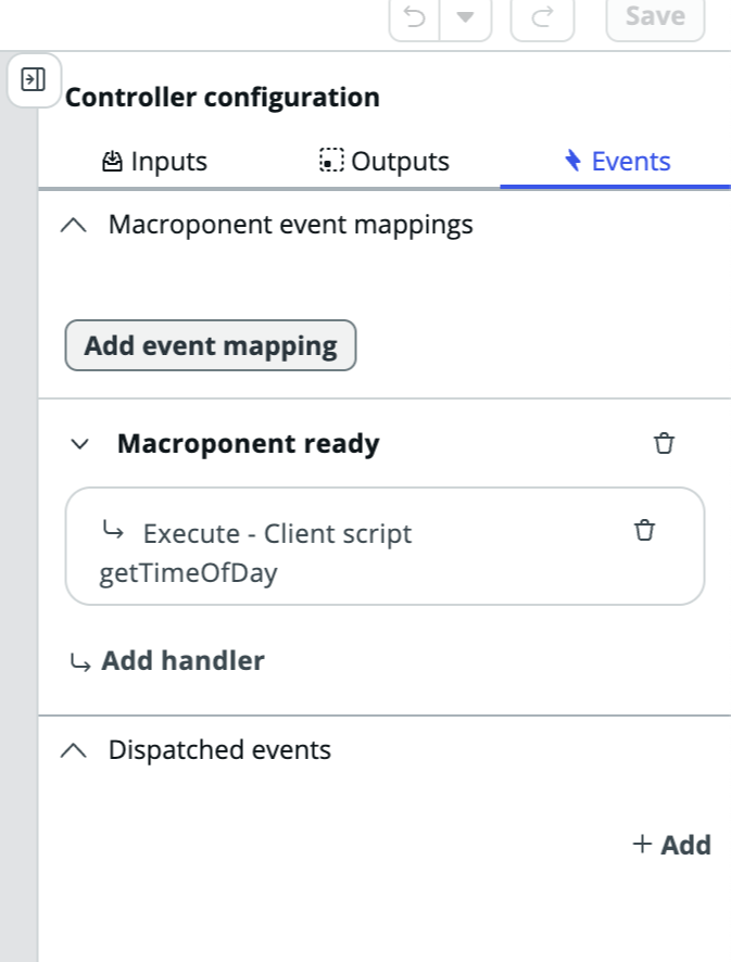
Added isDayTime (Boolean) as a client state parameters
On the Controller Configuration panel, I added isDaytime under Output and under Events, I added the Macroponent and added the Execute – Client script handler to bind my getTimeOfDay client script.
After I click save I was able to go back to my experience page and add that controller to the Data Resources section.


In the Conditional Renderer:
I used the Empty Container selection to build the condition
In this container I set up my morning banner by giving it a component label, component ID, and binding the EvaluateTimeOfDay controller for the condition: @data.evaluatetimeofday.isDaytime
Once that was created, I then added the image component inside the Fall Banner – Morning container
Then I created the second Empty Container to build the second condition for the Conditional Renderer
In this second container I set up the evening container by giving it a component label, component ID, and bind the EvaluateTimeOfDay controller for the condition: !@data.evaluatetimeofday.isDaytime
Once that was created, I then added the second image component inside the Fall Banner – Evening container.

Once the conditional renderer is set up you should see a green diamond next to the condition that is true and that image should be rendering. You should also see the conditions, under the configuration panel, that it shows “true” and “false”.
If you noticed the evening condition is slightly different as the morning condition, this is because of the added “bang” or NOT formula in front of the data binding route as when isDaytime=true the evening condition is false, when isDaytime=false the evening condition switches to true.
That’s all it took for the banner to automatically switch between a daytime and nighttime image.
👋 Custom Greeting Script
I wanted a friendly touch at the top, something more fun than a static heading. I added a Client Script as an event handler to the Page Ready Event Mapping Handler under the Body Page Configuration ⚡️Events that renders the custom greeting and rotates through random emojis based on the season:
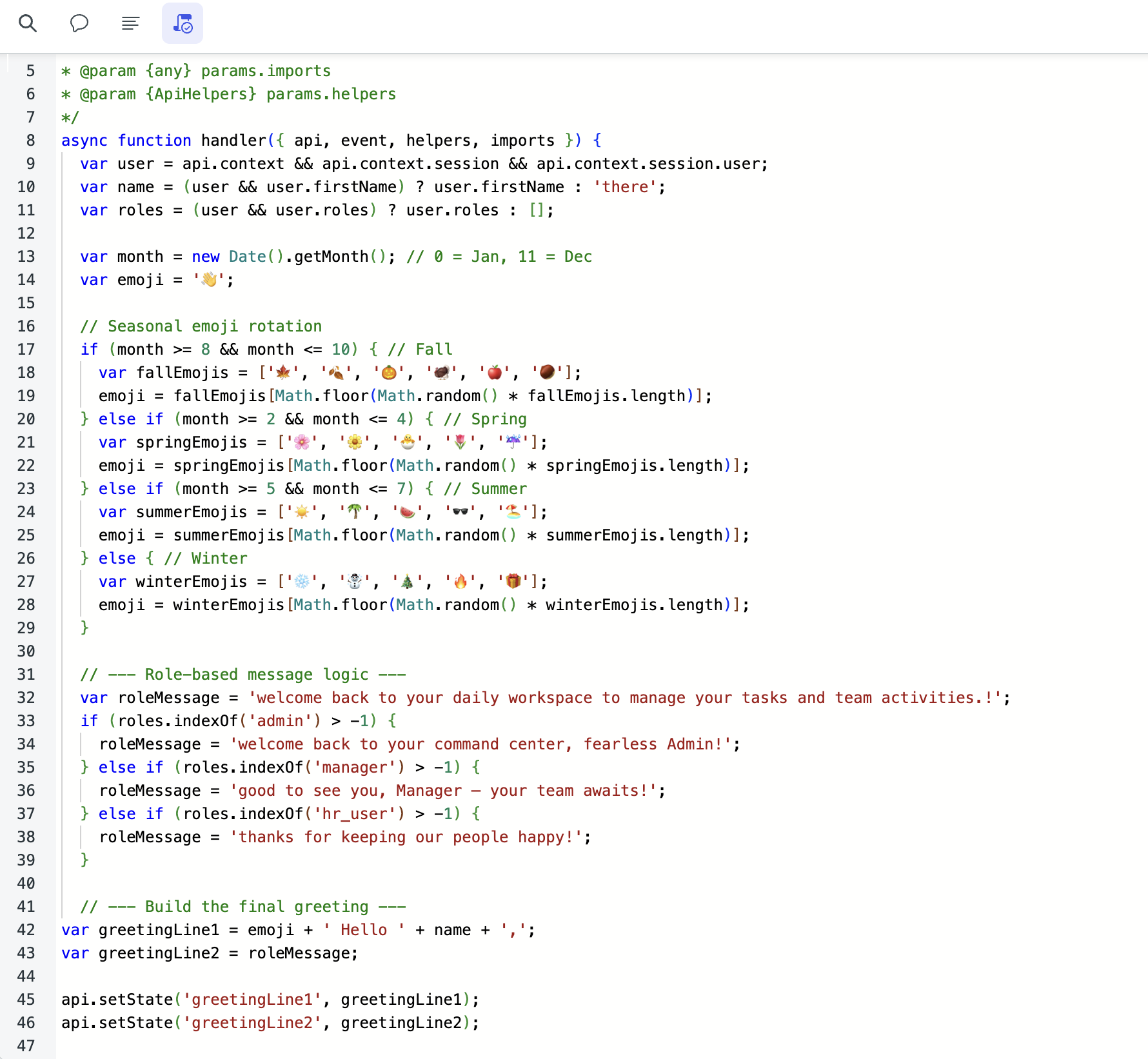
If you are wondering why I added that script to the Body, you are asking the right question. I attached it to the Body so it runs as soon as the page is ready, ensuring the greeting appears instantly for the user!
Then I used a Heading component and Stylized Text component to render:
For the heading component, under the configuration panel, I selected the Header-hero style and for the Label, I bound @state.greetingLine1. This line rotates the emojis on every page refresh and will render the logged in user’s name.
For the Stylized text component, under the configuration panel, I selected the H2 HTML tag and for the Label, I bound @state.greetingLine2. This line’s text changes based on which role a user is logged in as.
It’s small, but it makes the workspace feel like it knows who you are.
📅 Step 2: Bringing the Data to Life
Once the header was finished, I added the Upcoming PTO section.
🧱 Data Resource
I added a Look up multiple records (Time Off Records) data resource for the table sn_hr_core_emp_time_off
Configuration:
Table: sn_hr_core_emp_time_off
Fields: hr_profile, status, start_date, end_date, type, u_used_hours
Max results: 20
Return field metadata: true (this is to access the label field of the table, i.e. “Employee”)
This provided the dataset that powered the visual cards.
🔁 Repeater, Grid, and Flex Layout
To display the data, I used:
A Repeater component bound to @data.time_off_records.results
Inside the repeater, a Grid Container (3 columns × 2 rows)
Inside the grid, six Flex Containers to render and style each record
Each Flex Container contains two Stylized Text components
Stylized Text 1:
HTML tag: H4
Text: @item.value.field.label
Stylized Text 2:
HTML tag: Div
Text: @item.value.field.displayValue
This layout creates one dynamic card that displays six key fields and automatically adjusts its content for each record. The card design repeats about 20 times, depending on the number of records returned by the data resource.
It’s a clean, flexible setup that updates automatically with no custom code required.
🧮 Step 3: Generating Realistic Demo Data
Because HR Core doesn’t come with demo PTO data, I created a Fix Script to seed realistic records.
I started by inserting the demo users from the sys_user table into the sn_hr_core_emp_time_off table. Then I used the script to import those users and generate randomized start dates, end dates, hours, and statuses.
Inside the script, I also calculated the number of PTO hours automatically by comparing each record’s start and end dates. That simple calculation made the used hours field match the actual length of the request instead of a fixed value.
This approach gave me enough demo records to fill the table and power the data resource for the Upcoming PTO section without affecting any production data.
💡 Step 4: The Little UI Builder Tricks That Make It Work
Conditional Renderer loads only one image at a time, improving performance
Controllers handle logic like time-of-day visuals
Client State Parameters connect scripts directly to what’s displayed
Repeater with Grid and Flex Containers turns table data into cards
Fix Script generates realistic demo data safely
Each piece is simple, but together they show that UI Builder can do far more than most people realize.
🧡 Final Thoughts
Going “Beyond the Basics” doesn’t always mean building something complex.
Sometimes it means using the basics with intention.
A few thoughtful details: a dynamic greeting, a time-based image, and a clean card layout, turned a plain PTO list into a workspace people enjoy opening.
If you want to create something similar using these same techniques, let me know. I’d love to see what you build. Build on!